Showing posts with label When Bad Posters Strike. Show all posts

October 9, 2007

From the Vault: When Bad Posters Strike: Wind Child

I discovered today that I had a "When Bad Posters Strike" entry written up for Wind Chill saved in a word document that I just casually forgot to put into a blogger box and click "Publish" on. Perhaps I'll share them with you now because I can't think of anything else to write about. I don't ever remember this movie being released into anything more than a handful of cinemas so it's not even particularly mis-timed. Just consider it here for future reference.


I present to you a monologue spoken by Emily Blunt.

DEATH!!!!


What is it? Why is it? So many unanswered questions filter through my brain like the millions of neurons that surround them.

DEATH!!!!


Is it really as bad as they say? You see, I've been re-evaluating my religious stand as of late and I decided that yes. Yes there is a God. And if there is a God then surely there is a Heaven, right? Maybe in death we all do go to a magical afterlife. We go to a place surrounded by cool dead people like Marissa Cooper, Captain America and that hampster I had as a kid, Mittens. And there's people there who can hoola hoop for hours. Hoola Hoop while hopping on one leg. Omigod. Hoola Hoop Hopping. Try saying that ten times fast.

DEATH!!!!


Is there even such a thing as death? If there is a heaven then do we actually go through the process of death, and instead just have our souls transfered between one world and the next. You know. From the world of reality television and Wild Hogs-inspired remakes on to the world of edible palm trees and neverending meals-on-wheels.

DEATH!!!!


If this is really what death is like then, yes, sign me up right now. I want to skip the illustrious award-strewn career and the pink house in the Hollywood Hills as an old person who only comes out to celebrate the 75th anniversary of anything. I want to move straight from my current life of eye shadow and snarky comebacks and move right onto the other world.

Because I have indeed seen the light and I want to pass my newfound wisdom onto you. There are worse things than death!!!!

*cue trumpets*

Oh, wait. I'm trapped in a car and those are gas fumes not happy lala magical oxygen. Oh... so this is death. Okay, this is pretty shit. Oh, crap. I never thought I'd die because of a freakin' wind chill. Honestly. I feel ripped off. I blame Wild Hogs

{fin}

October 6, 2007

When Bad Posters Strike: The Other Boleyn Girl (Part II)

aka, the "It just gets worse!" edition.

IMP informs us (as does JD, which I only realised after the fact - thanks though!) that the poster for the Portman-Johansson-Bana period flick The Other Boleyn girl wasn't quite the final design. I apologise to those who were responsible for the Boleyn poster because I gave them a shellacking for that one - it was really poor.

But, as I said, that poster is no longer the official design. Now we have a new one!


And this time... IT'S WORSE! Didn't think that was possible? Well, they somehow managed it. How? Well, for starters the dress that Natalie Portman is wearing (the one that takes is 75% of the poster space) has been changed from a royal deep green to some sort of ecstasy raver dayglo bullshit green and all three cast members now have really red skin. It's like they turned the contrast on the image up from "neutral" to "wow, I can, like, touch the sky and the clouds are made of fairy floss. whoa."

Then they also decided for some unknown reason to crop the outer edge of the design so now not only are their foreheads chopped off now audiences don't even get the advantage of being able to ogle Scarlett Johansson's cleavage. And now, more than ever, Eric Bana's mysterious tit-grabbing hand looks even more like somebody just grabbed a prop hand prosthetic from a horror movie set and attached it to Portman's shoulder.

It just feels like they only had one image and they accidentally cropped it in Photoshop and saved it and they couldn't undo it. Surely this poster is a perfect example of how not to market your sexy period film, right?

October 2, 2007

When Bad Posters Strike: The Other Boleyn Girl

I've seen some shoddy photoshopping in my time (considering "my time" is about double the amount time that Photoshop has existed, but that's not the point) but the newly released (via) poster for The Other Boleyn Girl is just a bloody piss poor effort, don't you think?


Let's begin by pointing out the strange way the poster scalps all three of it's main castmembers heads off. It's not like they don't have plenty of space to move the poorly arranged cast down a centremetre or two. I keep trying to scroll the image up but I can't and it's bugging the hell outta me.

Now we can move along to the fact that whoever designed this didn't even attempt to make it appear as if these three people (Scarlett Johansson, Eric Bana and Natalie Portman, obviously) were photographed together. Instead it looks as if they just got screengrabs of Scarlett and Eric and haphazardly arranged them around an image of Natalie Portman. An image, which it much be said, features Portman striking a very similar pose to another regal movie poster. And then they edited in Bana's mysterious tit-grabbing hand for added... allure?

I'm not entirely sure what exactly happened to this movie. It was originally set for release this year, but - as the poster says there at the bottom - it is now set for release in, of all months, February. A historical period film based on a famous novel being released in February? Bizarre, but true. The cast gives off the illusion of being hip and sexy (and, the more said about Eric Bana's pants the better) and Portman's name along with the prestige of the book gave it an allure of quality - I even had it down for several Oscar nominations including Best Actress for Portman in my year-in-advance predictions - but somewhere along the way I think it went over the rails, it got bumped for whatever reason to a dead zone of February and now it seems the marketing is getting off to a decidedly shaky start with this strangely cobbled together poster.

I just wish they didn't cut off their scalps like they did. Perhaps I wouldn't feel as negative towards it. It's just so... aah! Perhaps Portman's forehead extends for kilometres and kilometres. I guess we'll never know.

To see more of this series simply click the "When Bad Posters Strike" tag below.

September 2, 2007

Well Played, Poster Vs. When Bad Posters Strike: Michael Clayton

I never commented on the poster for Michael Clayton because it seemed everyone else out there on the net was praising it (deservedly) and I couldn't be bothered rehashing everyone people had already said. So here is the poster, again. It's quite amazing, don't you think?


And now take a look at the newly released French poster for the same movie. It's not a necessarily bad poster (in other circumstances I wouldn't "Strike" it down) but when you compare it to the original American poster, well, it looks sort of direct-to-dvd. What with it's blue filter and all.


This is also one of the rare times when the foreign poster is actually far worse than the American version. It's usually the other way around. Hmmm.

July 2, 2007

When Bad Posters Strike: Margot at the Wedding


I now present to you an open letter to all professional poster designers.

Dear Professional Poster Designers,

My name is Glenn Dunks and I wish you would listen to what I have to say as I'm not sure you have heard me clearly. I have a mere two words for you that I wish would become your daily mantra.

Here we go. Are you ready?

Try. Harder.


Love,

Glenn Dunks

--

Take, for instance, the newly released poster for Noah Baumbach's Margot at the Wedding. This movie stars Nicole Kidman, aka one of the movie world's biggest stars. It also stars Jennifer Jason Leigh, aka sadly not one of the movie world's biggest stars, but who is a recognisable talent to film fans. It also stars Jack Black, one of the movie world's most recognisable stars and is probably quite popular too, although I am not a fan (which is neither here nor there).

Margot at the Wedding also, apparently, stars a whole lot of white space. That's the only explanation I can come up for a poster of a movie starring Nicole Kidman, Jennifer Jason Leigh and Jack Black to be almost entirely white space filled with nary an "Academy Award Winner/nominee" tag in sight or anything.

And then when you actually do look at the images used I could swear my eyes are playing tricks on me. Have they actually made Jack Black blurry? Have they actually made Kidman and Leigh look washed out and flat?

I adore the profile picture of Kidman with her adorable fuschia hat, but that image should take up the majority of the poster space, not just a small little section at the bottom. And I totally get what the designers must have been going for (twee! folksy! indie!) and I understand the use of simple plain font (to give it that simple "we don't need a fancy design to entice viewers" vibe), but mixed with the abundance of nothingness, the entire poster is rendered utterly pointless. There is nothing here whatsoever to entice people to see Margot at the Wedding other than the names of the cast.

Look, I'm not asking for much. Just a little bit of ingenuity. A bit of visual pinache. A flourish of design. I hate to bring out the tired ol' "I could've designed this myself" argument, but it's a blatant fact that even an idiot with only passing skills in Photoshop could have made this poster with a movie still and a default font of Ariel.

I'm sure this is only a "teaser" poster of sorts as there are no credits, nor is there even a tag line (seriously!) but that still doesn't excuse lazy workmanship. This poster is out there as a means of advertising Margot at the Wedding and I can't imagine anyone seeing this hanging up in the foyer of their local cinema and thinking "Oh, that looks good! Let's see that." Seriously. Would you? I doubt it. When the final design (if there is one, natch) arrives I doubt much will have changed. Movies like this don't often much in the way of advertising changes and tend to revolve their advertising around one focal recurring imagine - in this case, Nicole and her pink hat - and while that image may work on a 200x200pixel ad box in a sidebar on some website, it doesn't work hanging up in a cinema lobby.

I intend to watch Margot going to this wedding she is apparently going to, but it won't be because of this invitation.

June 11, 2007

Well Played? Bad Poster? You Decide!

I can't come to a conclusion about the new poster for Rob Zombie's Halloween remake/reimagining/reanimation/rewhataretheygonnacomeupwithnext? On one hand it could be really good - when my eyes first set upon it I really liked it. But then on the other hand, it could be really shite - after looking at it for a while I think it may be too cluttered?

I'm not sure! One thing I do know is that the long hair makes him look like some heavy metal groupie. Anyway. Below is the poster and below that is a poll. Feel free to vote. I have a feeling that option five is going to be popular though.


[Click to see Michael in all his glory]


(this is also a test to see whether I should bother doing polls in the future. if enough people vote I will, if not then i hate you all... well, not really)

May 3, 2007

When Bad Posters Strike: A Mighty Heart


Holy.
Freakin'.
Shit.


I'm sure I've joked around before claiming that I could have designed some of the posters Hollywood shoves into cinemas, but in all honesty (and here I am admitting it), I probably couldn't. But that stops here. Because, no doubt, I could have designed this poster. I could have conceived it, designed it, created it in Photoshop and then printed it off on glossy paper and claimed it was a flyer. No freakin' shit. I kid you not. Surely this is one of the laziest posters ever, right? I mean, really? THIS? This is what they want to represent their movie? It looks like a really low-grade airport pulp fiction novel or something.

I assume that this poster was made using $5 petty cash. The left over change from that $5 probably bought coffee for a couple of people on-set.

My god. I sort can't even believe they bothered to release this poster. I even put this question out there: Is the image used in the bottom half of the poster (the heavily saturated image of a man in chains) actually a discarded image taken during a photo session for Michael Winterbottom's (Mighty Heart's director) last film Road to Guantanamo. No kidding. Click the image to your left to look at the Guantanamo poster in full-size.

I also hypothesise that Dan Futterman obviously must've done something to piss off the poster designer. I am completely aware that he is apparently only in it for quite a small amount of time, but he still constitutes as a worthy name. I mean, he is playing Daniel Pearl afterall.

And speaking of Pearl, there is not one single mention of who or what this film is even about. The cliched tagline - "It was an event that shocked the world. This is the story you haven't heart." *yawn* - doesn't mention what this shocking event was. The title doesn't give a clue. The only thing I can gather is that Angelina has a perm.

...oh! Wait, now I get it. Angelina with a perm = the event that shocked the world. Okay, It makes sense now.

As for the film, it premiers at Cannes. Being a film by Michael Winterbottom, I predict it will be tediously slow, feature lots of scenes of people talking about nothing (and not in the self-referencial way) and maybe a nudie scene (though not of Angelina. She don't do that stuff anymore). I also predict that it will feel like 20 years of my life is flashing by in quick succession that can only be matched by the latest Catherine Breillat film.

April 10, 2007

When Bad Posters Strike: I Could Never Be Your Woman (Spanish Version)


I present to you a fictional conversation between Michelle Pfeiffer, Paul Rudd, Diane Keaton and Kate Winslet.

Michelle: Why are my eyes so buggy? And why is my hair so frizzy.

Paul: It's because buggy eyes and frizzy hair makes the audience know that you are a crazy and neurotic woman who can't keep a boyfriend. The headset you're wearing also demonstrates that you a) are a hard working business woman or b) still listen to your walkman and those delightful cassette tapes of Boyz II Men songs you recorded off of the radio.

Michelle: *shoots laser beams out of her eyes*

Paul: You're still hot though.

Michelle: Well thank you. I must ask... why do you look like Sarah Jessica Parker.

Paul: ...

Michelle: Why are you looking at me like that?

Paul: If I could shoot laser beams right now I would. At you. Even though you're still hot. You are neurotic.

Michelle: Neurotic my ass.

Paul: Holy shit, I really do look like Sarah Jessica Parker. Or a really bad drag version of her. That's so upsetting. Normally I'm attractive in a i-don't-care-what-you-think sort of way.

Michelle: I'm always attractive in a i'm-always-attractive sort of way.

Diane: Would you two shut up. Look, Michelle. I've won an Oscar. You haven't. Sad, I know, but you're not going to win one by copying me, alright. Just face it. I am the neurotic one. I am the slightly unhinged one. I am the one who shows up at awards shows wearing film costumes from the 1970s. I am the one who always has the bottom of the paper bag fall out on my way home from the grocery store only to have the man I have a high school crush on show up to help me. ME!

Michelle: Must... resist... urge... to kill... not... neurotic....

Kate Winslet: Hi guys! It's me, five time Academy Award-nominee Kate Winslet. Look, Michelle! Don't you listen to that crazy neurotic Diane Keaton. Us constant Oscar-losers need to stick together. Even if you have tried to copy me. Honestly. We're too good for these movies, really. Although at least you get Sarah Jessica Parker. I got shlubby Jack Black.

Paul: Hey!

Michelle: At least Jack Black doesn't look like Sarah Jessica Parker!

Paul: Hey!!! Whatever, at least I'm not a neurotic mess.

Michelle: *vapourises Paul Rudd with laser death stare*

Diane: Where's Jack Nicholson's sunnies when you need them?

Michelle: *vapourises Diane Keaton with laser death stare*

Kate: Look Michelle. You don't wanna kill me. We're like sisters. We're both really sexy and we've both never won an Oscar despite many, many nominations. We need to stick together.

Michelle: *vapourises Kate Winslet with laser death stare* Who's neurotic now?!?!

{fin}

April 6, 2007

When Bad Posters Strike: The Ex


I decided to not write anything about this "poster", but instead did a mockup design of what I imagine the original sketch directions were.


Seriously.

March 30, 2007

When Bad Posters Strike: September Dawn


The final in the When Bad Posters Strike series for today (they all seemed to pop up at once). For this I do not present a hypothetical conversation between Jon Voight and a black canvas with poor lighting. No. This one is much simpler. I merely present to you...

ON SEPTEMBER 11, 1857,
IN AN UNSPOILED VALLEY
OF THE UTAH TERRITORY --
AND IN THE NAME OF GOD --
120 MEN, WOMEN AND CHILDREN
WERE SAVAGELY MURDERED.

WHO ORDERED THE MASSACRE,
AND WHY,
HAS BEEN HIDDEN
IN A CLOAK OF SECRECY
AND CONSPIRACY.

AND THE REPUTATION
OF ONE OF THIS NATION'S
MIGHTIEST RELIGIOUS FIGURES
HAS BEEN PRESERVED
AND PROTECTED.

UNTIL NOW.


Missed it? I'm not sure how because it takes up half the god damn poster, but here it is again.

ON SEPTEMBER 11, 1857,
IN AN UNSPOILED VALLEY
OF THE UTAH TERRITORY --
AND IN THE NAME OF GOD --
120 MEN, WOMEN AND CHILDREN
WERE SAVAGELY MURDERED.

WHO ORDERED THE MASSACRE,
AND WHY,
HAS BEEN HIDDEN
IN A CLOAK OF SECRECY
AND CONSPIRACY.

AND THE REPUTATION
OF ONE OF THIS NATION'S
MIGHTIEST RELIGIOUS FIGURES
HAS BEEN PRESERVED
AND PROTECTED.

UNTIL NOW.


My personal favourite bit is the part about the massacre being cloaked in secrecy. The part about the untouched valley in the Utah Territory was a crackup too. Honestly. They can't be serious. It's still better than "I Shot My Wife... PROVE IT."

March 29, 2007

When Bad Posters Strike: Fracture


I present to you a fictional conversation between Anthony Hopkins and Ryan Gosling.

Anthony: I shot my wife... PROVE IT!

Ryan: Er, you just confessed.

Anthony: ....

Ryan: No doubt, you just confessed to shooting your wife. Case solved.

Anthony: No, but...

Ryan: But what? You just solved my case.

Anthony: But don't you need... evidenciary proof?

Ryan: You've been watching Legally Blonde again haven't you?

Anthony: Maybe.

Ryan: Well, if Legally Blonde has taught me anything, and lord knows hasn't everyone learnt something from that movie? It's that a confession is as good as any evidence. Sure, it'd be nice to have your blood-stained shirt or your fingerprints on the gun, but considering you're, I presume, our prime witness a confessions seems good enough to send you to jail. And from the looks of it, you shot her through a plait-glass window, which made it, wait for it... wait... are you ready? Made it... FRACTURE. Thank you, thank you. I'm here all week.

Anthony: I do like looking through... wait for it... fractured glass. It's elegant yet chilling.

Ryan: You're an idiot. Stop stealing my material and diminishing it at the same time. Anyway... you confessed. Case seems pretty well shut.

Anthony: Nuh-uh

Ryan: Uh-huh

Anthony: Really?

Ryan: I assume so.

Anthony: Well that's worse than a kick in the pants, isn't it?

Ryan: No, actually. Consider this. You've won an Academy Award and I was just nominated for one and we're now in a movie with this ridiculous plot.

Anthony: Touche.

{fin}

When Bad Posters Strike: Georgie Rule


I present to you, a conversation between Jane Fonda, Felicity Huffman and Lindsay Lohan.

Jane: So, this is where it's at. I'm gettin' old. In December this year I will turn 70. It's true. You know who else was old when she made this movie? Katherine Hepburn. So not only am I cast in a movie with the exact same plot as On Golden Pond, I have now been made up to look like her! Look at the wrinkles around my eyes and lips. I look nothing like I do on those television commercials for that skin rejuvinating product. Something Something Ole! I dunno. Is it Mexican? I'm old, I've forgotten what products I advertise. But the point is that either this is what I really look like and I'm juping the people who clamour at the Myer counter in a desperate, usually failed, attempt at getting back the youth that they once had. Or the youth that I once had and they think that they can capture. Because, let's face it, they were probably ugly while I was beautiful. I was a Hollywood superstar. They probably worked at Denny's. Anyway. The other option is that this is just a really weird-looking make-up job and they decided to stick it front and centre on the poster to my new movie. It worked for Helen Mirren, but it didn't work for Peter O'Toole. I think I'm in the middle. What do you think Felicity?

Felicity: To be honest, I've got other concerns. My forehead has been pulled so far back that I look like Mount Rushmore. Seriously, has my face always been so skinny and long? I also still sort of look like my character from Transamerica.

Jane: Hahahaha, see. I don't think Garry Marshall likes us. I look ridiculous in this silly denim jacket. Who wears denim jackets at my age? And by "my age" I mean the age that Garry Marshall has tried to make me look. Because I, Jane Fonda, am still hip and cool. I could totally get away with this denim jacket. I was in a J.Lo movie! I'm cool.

Felicity: Oh god, that collar is huge!

Lindsay: Hey guys. I at least look pretty.

Jane: Ugh. You? We spite you. We throw fire and brimstone at you.

Felicity: I think I could serve a five coarse meal on this jacket collar, really.

Lindsay: But, really. My skin has been airbrushed so that I don't look like I had alcohol poisoning but kept my adorable freckles, which humanise me and make me like everyone one. Plus my hair is nice and I don't look ten years older than I really am.

Jane: I dislike you right now.

Lindsay: I don't understand. I also don't understand the title of this movie.

Felicity: My blouse is ugly.

{fin}

October 26, 2006

When Bad Posters Strike: Déjà Vu (Part II)


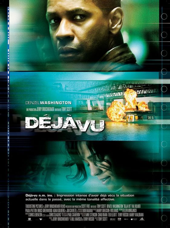
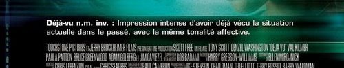
I thought the insults towards the Déjà Vu poster were over, but no. They decided to create a new one for France, and man... levels of stupidity. Okay, well, it may not be completely ridiculous because I'm sure there's some French still in the dark, but does anyone else find it slightly silly that the tagline is word for word, the dictionary description of "déjà Vu". Ya know, considering it's a French term.


And then there's the design of the poster. This is one of the standard thriller designs. Similar examples can be seen here, here and here. They usually have three or four panels, depending on number of main cast members. Each panel has a different cast member and they all happen to be facing opposite directions. Like at the top they'll be looking left, middle right and bottom left again. Or like the Under Suspicion poster, they all look at the same direction, but they are placed on opposite ends.

Ciao. I need sleep.

October 11, 2006

When Bad Posters Strike: Infamous


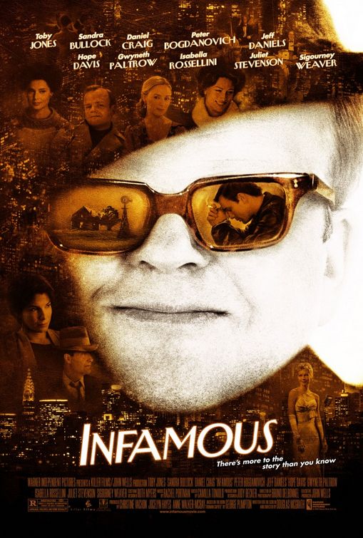
Words cannot express how much I hate this poster for Infamous. But, really, the inability to express cohesive thoughts hasn't stopped me before, so I'll go.

It. Is. Ugly.


The images in the glasses is a great touch, as is the New York City skyline at the bottom. But they chose an awful image of Toby Jones (as Truman Capote), one that makes him look like a man who wants to flash you but removing his trenchcoat. Then they've copied and pasted the image of the skyline all around him and stuck in pictures of all the famous people (btw, why put a small image of Tony Jones above the big picture of Toby Jones) There's no pattern to their placement. They're just stuff in random places. And then there's the tag line. Y'all know how much I hate tag lines when they're really really bad. Here is another one. "There's more to the story than you know."

I suppose they couldn't really put "There's more to the story than you saw in Capote" or "There's more to the story if you haven't read the book" or "There's more to the story than a bad fedora and a squeaky voice" (which is what the trailer makes it look like all they did to make Toby Jones look like Truman).

I really had hope for this movie because while I liked Capote well enough, I thought it's cold exterior was offputting. Like, the character of Capote was cold and guarded, so it was annoying to see the movie be just as guarded. I was hoping Infamous might be more about the New York scene and such, but watching the trailer made it look just like Capote (there are identical shots)

God this poster if ugly. Too cluttered and confusing and if you didn't know what the movie was about you'd still have zero idea after looking at the poster. Oh well.

October 6, 2006

When Bad Posters Strike: Déjà Vu

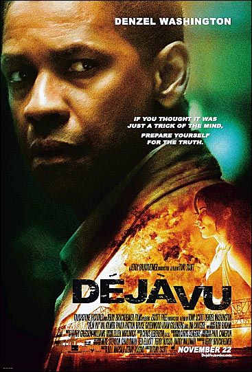
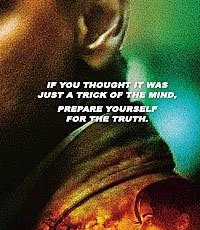
I'm thinking this will be a regular feature here at Stale Popcorn, purely based on the fact that there are so many awful awful movie posters out there. A while back I discussed the truly stupid poster for The Reaping (The Hilary Skank "ten biblical plagues" movie that's out early next year). Now we get the get the terrible poster for the terrible-looking Denzel Washington movie Déjà Vu (a movie I thought sounded ridiculous the moment I heard about it).

While The Reaping can still hold the mightly claim of having the worst tagline (you're not meant to be reviewing the movie in the tagline, okay!) at least that one had some half-decent design to it (with the locusts or moths or whatever they were), but the Déjà Vu poster is just lazy (although not as lazy as all those horrible posters of somebody standing amongst a sea of white. They're the worst). See it below in all it's, ahem, glory.


What we have is Denzel Washington standing. Or I think he's standing. Possibly sitting. So, we have Denzel most likely standing but possibly sitting, looking over his shoulder at... something!!! Ooh. You're hooked aren't you? And for some reason his shoulder is ablaze. And someone who I think is Eva Mendes, but I'm not sure (she's not credited on the poster, neither is Val Kilmer or Jim Caviezel or Bruce Greenwood. Poor them.) is there as well. Is he trying to look at her? Cause he's not looking in the right direction.

So, so far we have Denzel possibly sitting but most likely standing, looking at something that's behind him and his shoulder is on fire and a woman is magically floating. And then we get to the tag line. Oy. Read and be perplexed, people.

IF YOU THOUGHT IT WAS JUST A TRICK OF THE MIND,

PREPARE YOURSELF FOR THE TRUTH.


Is "the truth" that deja vu isn't actually a trick of the mind, but is just a normal thing that happens from time to time? I suppose they couldn't put that on the poster could they? "If you thought it was just an event that everybody sometimes gets... prepare yourself for being told that you are correct." Seriously. What's so SHOCKING that everybody on the planet has been mislead about?

Now, if you actually know the plot of the movie, it makes even less sense (as does the title of the movie itself). Turns out the government (or whoever) has invented a device that allows one person to travel back in time four days. And I think there's a ferry accident and Denzel goes back in time to stop it but in the mean time falls in love with one of the soon-to-be victims. I'm still confused as to what the truth is. That deja vu is when somebody experiences something twice? BECAUSE THAT'S WHAT IT MEANT IN THE FIRST PLACE!

Plus, it's not technically even deja vu! He's reliving the time! Not having (to quote Wikipedia) "the experience of feeling that one has witnessed or experienced a new situation previously." He's not having a feeling. He knows he's witnessing it again. But, again, deja vu means that that you experience something twice at different times. I don't think it counts if you TRAVEL BACK IN TIME!

Plus, I don't "think" it's a trick of the mind. I KNOW it's a real occurance. It's not your mind playing tricks on you.

Ugh. This poster is making me go around and around in circles.

But, seriously, if you saw that poster in at the cinema what would you make of it? Would you have any idea what it was about. I'm sure you'd be pretty certain that at some point Denzel looks over his shoulder.

Or, here is my final theory, the poster (and the movie as a whole) is a big ol' elaborate joke. Because deja vu is all about experiencing something twice, could it be that the filmmakers are having a game with us because we've seen this all before? Maybe not with the sci-fi twist but the lone man must rescue the woman he loves before time runs out scenario has played out many a time at the multiplex. It's almost as if while sitting there in the cinema you get the "feeling that one has witnessed or experienced a new situation previously."

Those wiley Hollywood producers! Sneaky bastards.

**And before I go (to bed. I'm sleepy), do we have to type the title of this movie with the accents every time? I've already given up.**