
I can't tell whether the bloody streaked zombies make this poster entirely awesome, or if the weirdly silly photoshopping on Nicole and Daniel make this poster entirely shit.
I'm leaning more towards positive, but something just seems... off. Especially with the image of Nicole. Does anybody else feel that? I dunno. I can't put my finger on it. Maybe with a different movie still it wouldn't look so... awkard? Hmmm. I'm going to need to ponder this one a bit more.


7 comments:
I'm with you on this one. I almost posted it yesterday but was having the same inner monologue. Nicole looks really off but I can't figure out why, her head just doesn't seem to match her body, like she could never turn her neck to that angle maybe? But I really like the bloody streaked figures and the way it calls back to the 1978 Invasion poster's stretched out human forms.
Generally, I like it.
Nicole doesn't look entirely like Nicole, but she has an iconic 1950s woman-in-peril look that works.
Also dig the mostly monochromatic approach, and that big stars aren't beneath making a genre poster for a genre film.
Vast improvement over the teaser poster, which was a little too indie (and derivative of "I Hate Everyone") for a big studio picture.
I'm getting the impression Craig is gonna turn out to be evil or an alien or something b/c of his weird eyes on the poster
The zombies on the background look freaking great! Nic and Daniel...not at all.
--------------------------
Inland Empire is getting released here on Friday.
WoooooooooooooooooooooooooW!
Okay, so I'm glad others are having the same issues. I had written something out but thought people would just yell at me again so I simplified it. But, yes, the general idea: Nicole looks sort of not right.
Nice call by Mehta though. They could very well have been going for that 1950s thriller look with Nicole. Hmmm.
Very perplexing indeed.
I just don't think a reddened image of Nicole and Daniel matches what they were going for... or, I don't know. I really don't.
Nicole really looks like a Hitchcock girl in that photo. That's a good thing, lol.
If you ask me, it's Daniel that puts the poster off. He's hot and all but at least Nicole's expression seems to fit with the movie's story? Daniel just is like....there.
I really like the top half. And I think the idea behind it was to call back to the old creature feature films back in the day. But it isn't fully working. It's like half and half, lol.
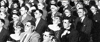
I actually like it! This may have been an accident (I'm giving them the benefit of the doubt and saying it was intentional) but I agree with it looking like an old 50's/60's horror movie poster. I think it works and it's cool.
It's not as good as the first poster which I think is one of the best this year so far.
Post a Comment