
I thought the insults towards the Déjà Vu poster were over, but no. They decided to create a new one for France, and man... levels of stupidity. Okay, well, it may not be completely ridiculous because I'm sure there's some French still in the dark, but does anyone else find it slightly silly that the tagline is word for word, the dictionary description of "déjà Vu". Ya know, considering it's a French term.

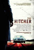
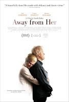
And then there's the design of the poster. This is one of the standard thriller designs. Similar examples can be seen here, here and here. They usually have three or four panels, depending on number of main cast members. Each panel has a different cast member and they all happen to be facing opposite directions. Like at the top they'll be looking left, middle right and bottom left again. Or like the Under Suspicion poster, they all look at the same direction, but they are placed on opposite ends.
Ciao. I need sleep.



No comments:
Post a Comment