(click to enlarge either)
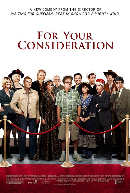
For Your Consideration - It works as a poster AND as a FYC campaign at the same time! I think it could've been better because while you get the sense that it's about movies in some form it's not very clear. But maybe they needed to do that to not alienate the people aren't awards-savvy who may be turned off by the topic (which, unlike dog shows, may not be enthralling comedy for some).
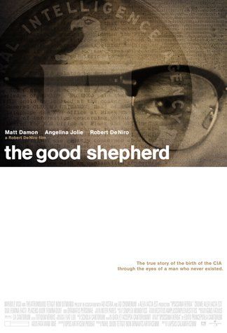
The Good Shepherd - I'm torn over this one. One one hand I love the top half and it really gives off the vibe of the movie. And i love that they didn't use big ol' floating heads. But then... the bottom half? I really liked what they did with the Match Point poster that had the exact same design - but for that poster it felt right for whatever reasons. On the Shepherd poster it just looks... empty.
Wait. After looking at it for a bit more I think I actually like it. If you look at it you start to notice that is actually looks like a confidential file or something. With the plain ariel font and such. Hmmm. But is this enough to get people to see the movie? Also, I dislike the name.


2 comments:
An unrelated comment - I've seen your photo several times at The Film Experience and I always thought that you were wearing a red cape (looking like a magician). But today I clicked on your photo to see it larger, and I realized that there is someone hugging you from behind wearing a Spider-man costume.
I know, lame comment.
http://kamikazecamel.blogspot.com/2006/07/my-night-with-spiderman.html
that's the whole picture! My Spiderman is the greatest.
Post a Comment